Crafting the UX for email deliverability
infrastructure at scale
Role
Product Designer
Domain
B2B SaaS
Platform
Web app
Peeker AI is an email deliverability and inbox infrastructure product built for cold email teams. Cold emailers often land in spam without knowing why, and spend valuable time trying to fix it manually.
This is the gap Peeker bridges, with deliverability analytics and ready-to-send warmed up inboxes.
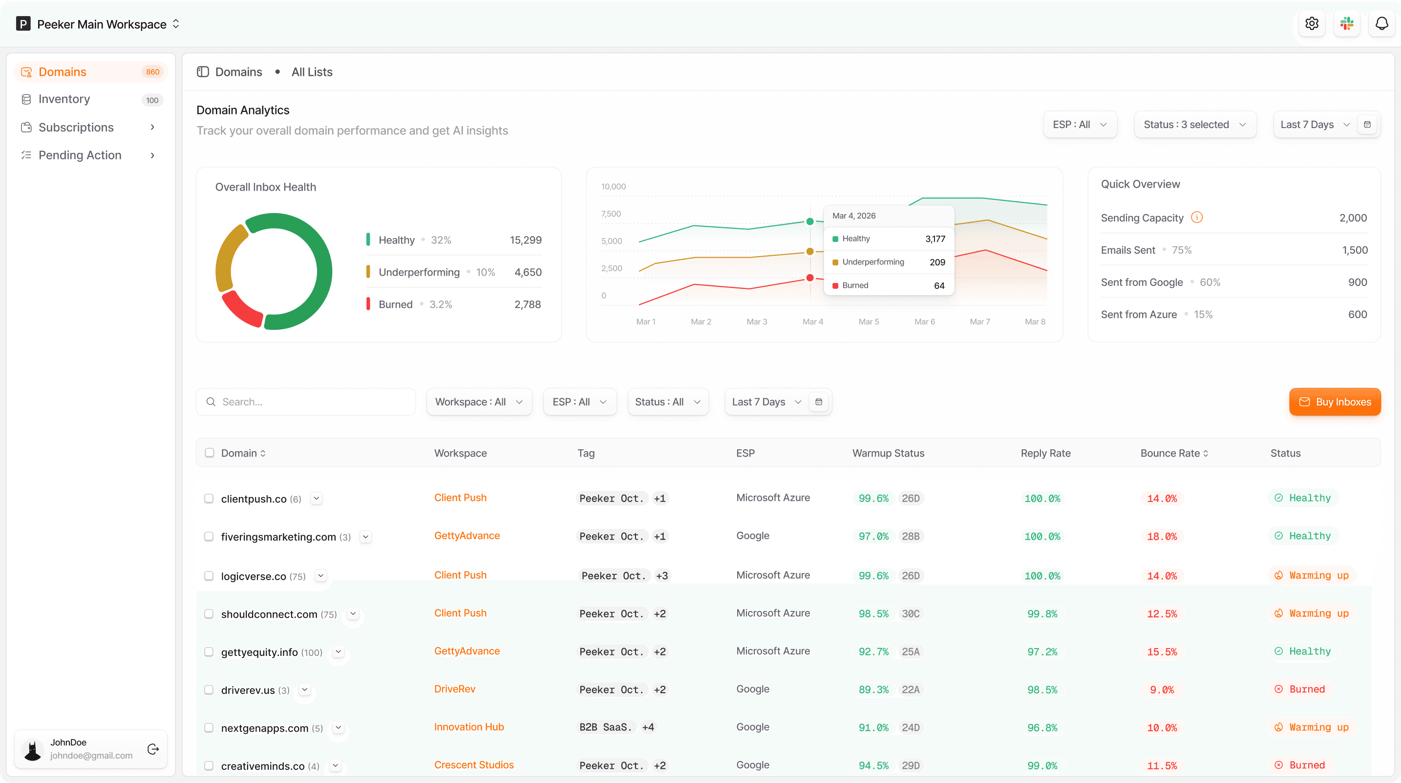
Why this product exists (the problem)
Cold emailers send thousands of emails when running campaigns, but most of these emails get lost in spam and never reach their intended audience. While tools exist to track campaign metrics (emails sent, open rates, reply rates, e.t.c.), there is no clear way for cold emailers to know when emails are landing in spam, understand why it's happening, or know how to fix it.
The goal was to build a solution that automates inbox performance tracking in real time, detects and automatically replaces burned inboxes, and reconnects disconnected ones without manual intervention.
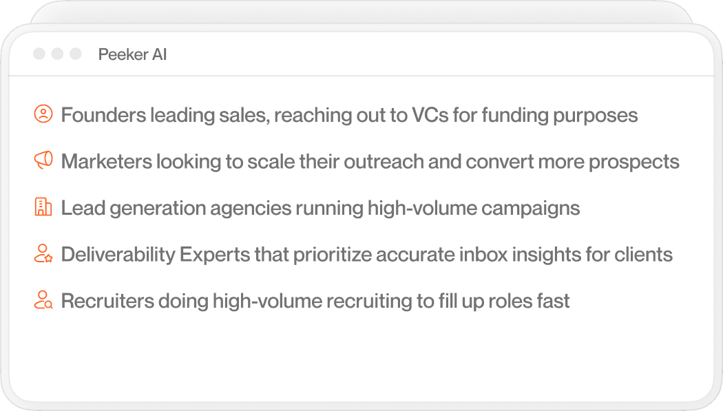
Target audience
The approach
Peeker's email infrastructure product is new to the market, so a key design goal was a dashboard experience that gives users quick insights at a glance and prompts clear action. Core data points from user interviews revealed that users needed analytics at both the domain and inbox level, with the domain view
offering an aggregate picture of all associated inboxes.
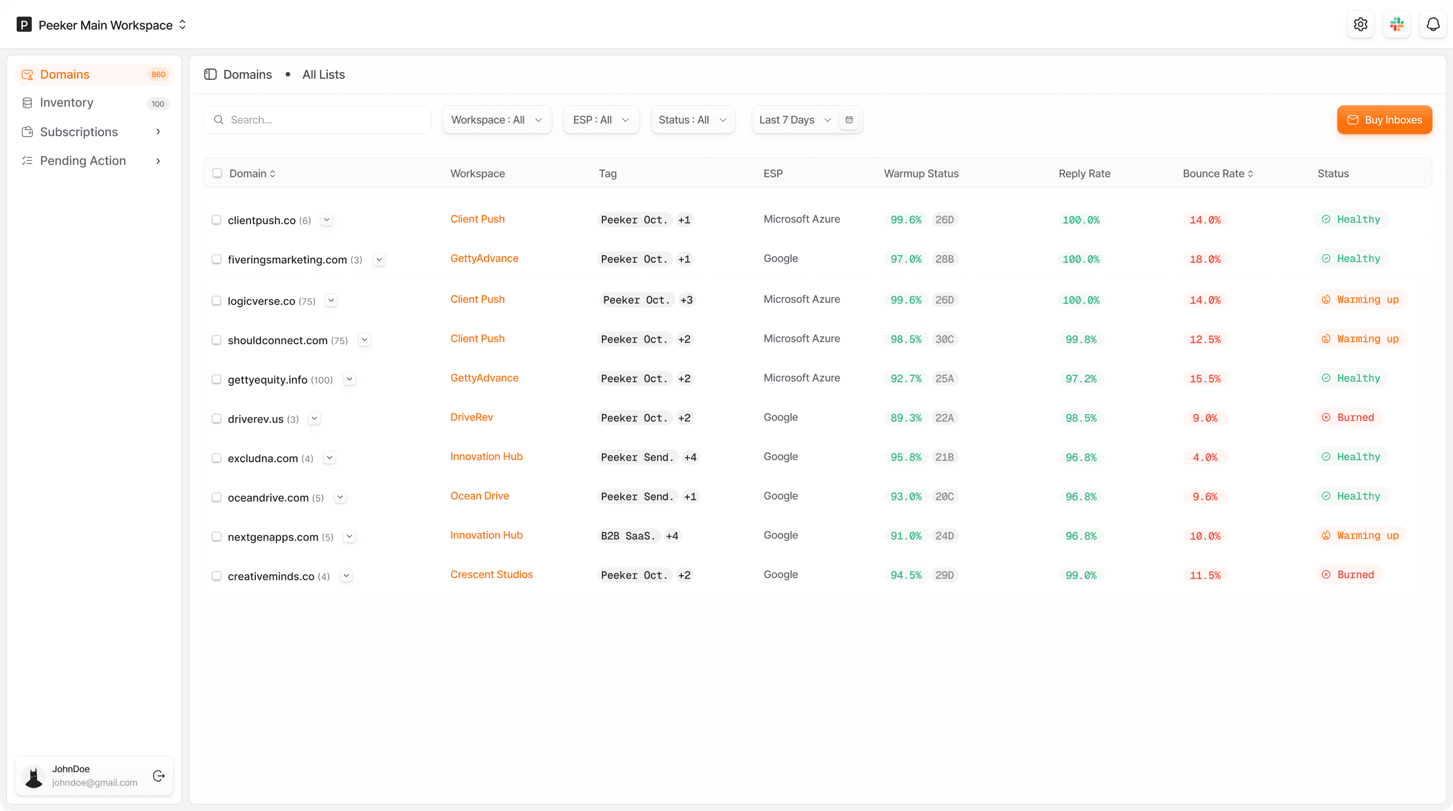
Analytics at domain level
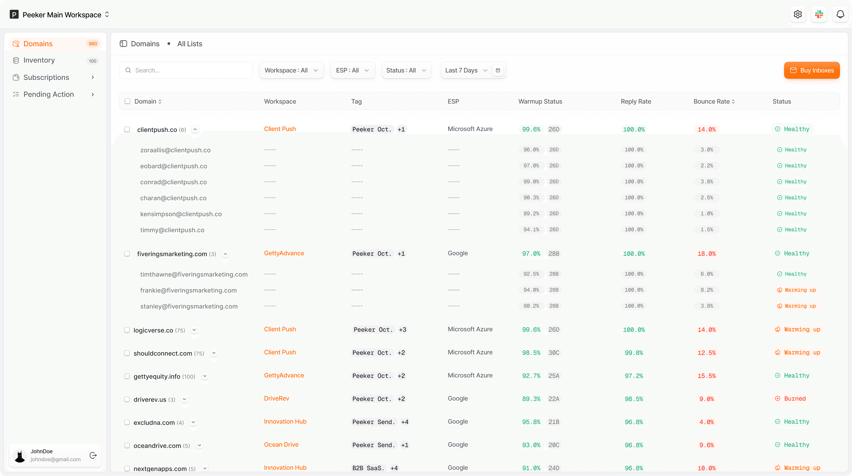
Analytics at inbox level
Trade-offs
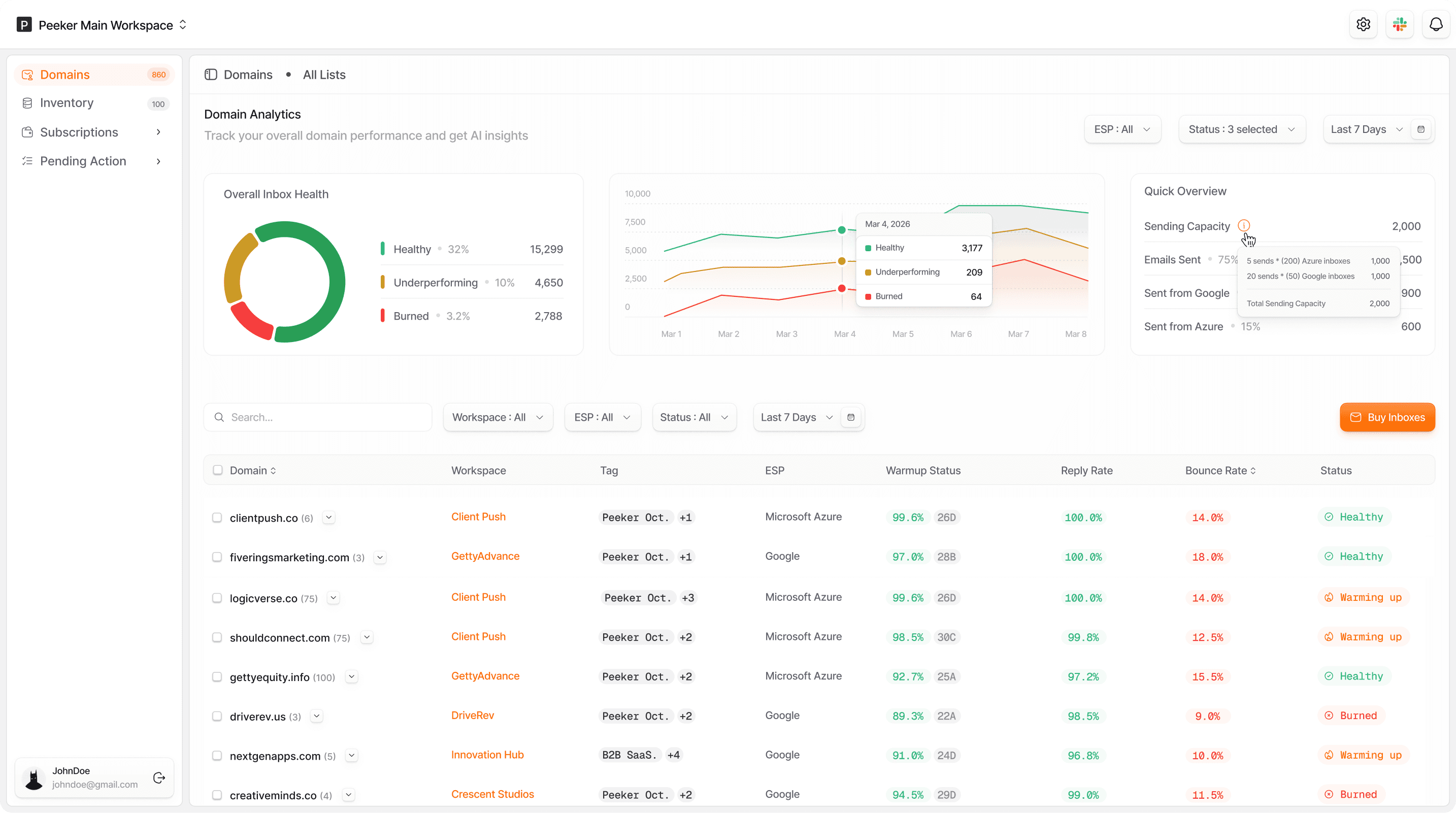
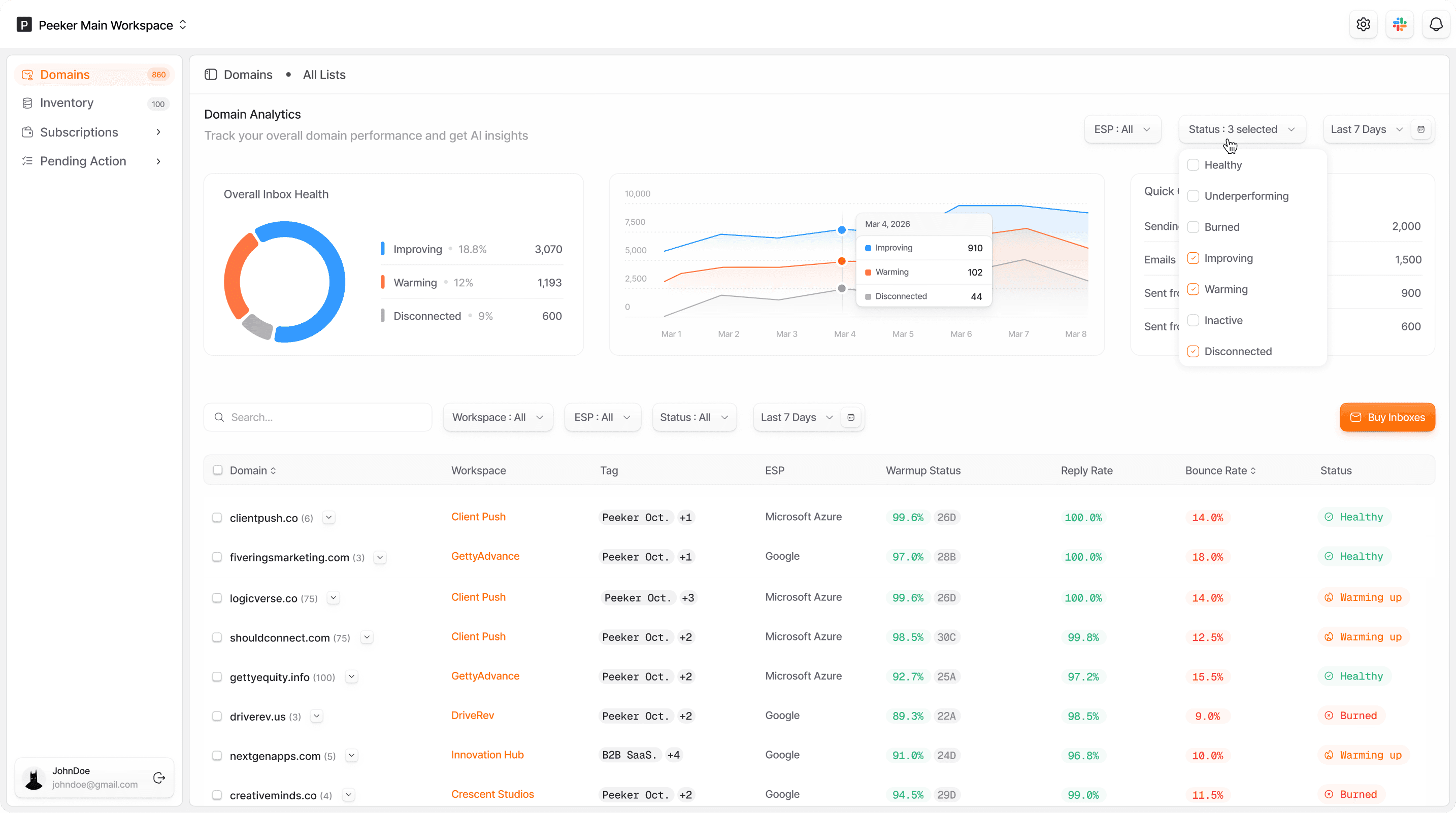
For the data visualization experience, the goal was something interactive and easy to read at a glance. Through A/B testing, we explored multiple directions and narrowed it down to two final concepts, selected based on statistical insights.
First concept
The data visualization in this concept was purely metadata, informational by nature, with no direct user actions tied to business outcomes. To give users some control, we introduced filters that allowed them to drill down into the specific data most relevant to them.
Filters applied
Second concept
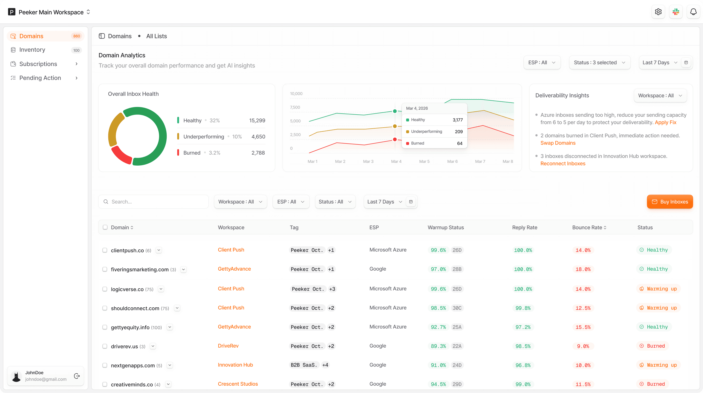
This was the finalized direction as it goes beyond displaying data. Users get a clear picture of what's affecting their email deliverability, paired with guided next steps to address each issue. The intent was to close the gap between awareness and resolution, so users aren't left interpreting data on their own and wondering what to do next. By surfacing the right information alongside actionable prompts, this concept directly ties the dashboard experience to business outcomes with healthier
inboxes, better deliverability, and less time lost to guesswork.
The Outcome
The primary objective was to grow the product's user base. Revenue was driven primarily by the sale of Google and Microsoft Azure inboxes, supported by the platform's analytics feature. By reducing the friction of inbox management and surfacing actionable insights upfront, the design played a key role in driving a 21% activation rate and a 13.2% retention rate, indicating that users found enough value
in the experience to keep coming back.
Let’s work together
Reach Out!
2026 Tolu Shaola
Crafting the UX for email deliverability infrastructure at scale
Peeker AI is an email deliverability and inbox infrastructure product built for cold email teams. Cold emailers often land in spam without knowing why, and spend valuable time trying to fix it manually. This is the gap Peeker bridges, with deliverability analytics and ready-to-send warmed up inboxes.
Role
Product Designer
Domain
B2B SaaS
Platform
Web app
Why this product exists (the problem)
Cold emailers send thousands of emails when running campaigns, but most of these emails get lost in spam and never reach their intended audience. While tools exist to track campaign metrics (emails sent, open rates, reply rates, e.t.c.), there is no clear way for cold emailers to know when emails are landing in spam, understand why it's happening, or know how to fix it.
The goal was to build a solution that automates inbox performance tracking in real time, detects and automatically replaces burned inboxes, and reconnects disconnected ones without manual intervention.
Target audience
The approach
Peeker's email infrastructure product is new to the market, so a key design goal was a dashboard experience that gives users quick insights at a glance and prompts clear action. Core data points from user interviews revealed that users needed analytics at both the domain and inbox level, with the domain view offering an aggregate picture of all associated inboxes.
Analytics at domain level
Analytics at inbox level
Trade-offs
For the data visualization experience, the goal was something interactive and easy to read at a glance. Through A/B testing, we explored multiple directions and narrowed it down to two final concepts, selected based on statistical insights.
First concept
The data visualization in this concept was purely metadata, informational by nature, with no direct user actions tied to business outcomes. To give users some control, we introduced filters that allowed them to drill down into the specific data most relevant to them.
Filters applied
Second concept
This was the finalized direction as it goes beyond displaying data. Users get a clear picture of what's affecting their email deliverability, paired with guided next steps to address each issue. The intent was to close the gap between awareness and resolution, so users aren't left interpreting data on their own and wondering what to do next. By surfacing the right information alongside actionable prompts, this concept directly ties the dashboard experience to business outcomes with healthier inboxes, better deliverability, and less time lost to guesswork.
The Outcome
The primary objective was to grow the product's user base. Revenue was driven primarily by the sale of Google and Microsoft Azure inboxes, supported by the platform's analytics feature. By reducing the friction of inbox management and surfacing actionable insights upfront, the design played a key role in driving a 21% activation rate and a 13.2% retention rate, indicating that users found enough value
in the experience to keep coming back.
Let’s work together
Reach Out!
2026 Tolu Shaola
Crafting the UX for email deliverability infrastructure at scale
Peeker AI is an email deliverability and inbox infrastructure product built for cold email teams. Cold emailers often land in spam without knowing why, and spend valuable time trying to fix it manually. This is the gap Peeker bridges, with deliverability analytics and ready-to-send warmed up inboxes.
Role
Product Designer
Domain
B2B SaaS
Platform
Web app
Why this product exists (the problem)
Cold emailers send thousands of emails when running campaigns, but most of these emails get lost in spam and never reach their intended audience. While tools exist to track campaign metrics (emails sent, open rates, reply rates, e.t.c.), there is no clear way for cold emailers to know when emails are landing in spam, understand why it's happening, or know how to fix it.
The goal was to build a solution that automates inbox performance tracking in real time, detects and automatically replaces burned inboxes, and reconnects disconnected ones without manual intervention.
Target audience
The approach
Peeker's email infrastructure product is new to the market, so a key design goal was a dashboard experience that gives users quick insights at a glance and prompts clear action. Core data points from user interviews revealed that users needed analytics at both the domain and inbox level, with the domain view offering an aggregate picture of all associated inboxes.
Analytics at domain level
Analytics at inbox level
Trade-offs
For the data visualization experience, the goal was something interactive and easy to read at a glance. Through A/B testing, we explored multiple directions and narrowed it down to two final concepts, selected based on statistical insights.
First concept
The data visualization in this concept was purely metadata, informational by nature, with no direct user actions tied to business outcomes. To give users some control, we introduced filters that allowed them to drill down into the specific data most relevant to them.
Filters applied
Second concept
This was the finalized direction as it goes beyond displaying data. Users get a clear picture of what's affecting their email deliverability, paired with guided next steps to address each issue. The intent was to close the gap between awareness and resolution, so users aren't left interpreting data on their own and wondering what to do next. By surfacing the right information alongside actionable prompts, this concept directly ties the dashboard experience to business outcomes with healthier inboxes, better deliverability, and less time lost to guesswork.
The Outcome
The primary objective was to grow the product's user base. Revenue was driven primarily by the sale of Google and Microsoft Azure inboxes, supported by the platform's analytics feature. By reducing the friction of inbox management and surfacing actionable insights upfront, the design played a key role in driving a 21% activation rate and a 13.2% retention rate, indicating that users found enough value
in the experience to keep coming back.
Let’s work
together
Reach Out!
2026 Tolu Shaola